CASE STUDY
Imagining Venmo with donation capabilities
What if donating to a Charity were as easy as paying someone back on Venmo?
ROLE

UX SKILLS

OUTPUT

TIME

TOOLS
Project Manager
UX Designer
Project management
Wireframing
High-fidelity prototyping
Information architecture
High-fidelity clickable prototype for mobile
Two-week design sprint
Sketch, Adobe Illustrator, InVision, Sharpies
The problem
Venmo is famous for quick, easy and fun financial transactions. How can you make the donation process fit seamlessly into the Venmo experience?
COMPETITIVE ANALYSIS

EMPATHY INTERVIEWS

(6)
(2)
PERSONA


(2)
USER TESTING
Constraints
USER
-
Ease of use
-
Conduct transactions in as few clicks as possible
TECH
-
Native app
-
Apple & Android solution
-
Interfacing with charity organizations
BUSINESS
Although we were working in a team, it was important for us to each get practice in as many areas as possible. (In parentheses) are the elements which I conducted myself.
-
Long term positioning (socially responsible) vs. short term profit and shareholder interest
-
Not to become a donation app - to stay Venmo
-
100% of donation to the charity
Research methods
USER FLOWS

(1)
INFORMATION ARCHITECTURE

(1)
Empathy interviews
I was responsible for drafting the consent form, screener and interview questions during the research portion of this project. We focused on two different groups of users: people who use Venmo and people who donate regularly.
We wanted to delve into what makes Venmo users love Venmo and understand how they use it, and we wanted to delve into the minds and motivations of people who donate.
We conducted 11 interviews. Although our research revealed that the two groups often overlap, had we just interviewed the subset we would have lost vital information.


"Venmo is a currency for college students"
- Venmo SuperUser
Images of interview questionnaires for Venmo users and People who donate regularly.
Synthesis

.jpg)
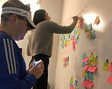
In the synthesis of our research we did affinity mapping. I then designed a dot voting spreadsheet to give our group the ability to collectively prioritize our user insights. Because it was digital, it was accessible to all members of our team.
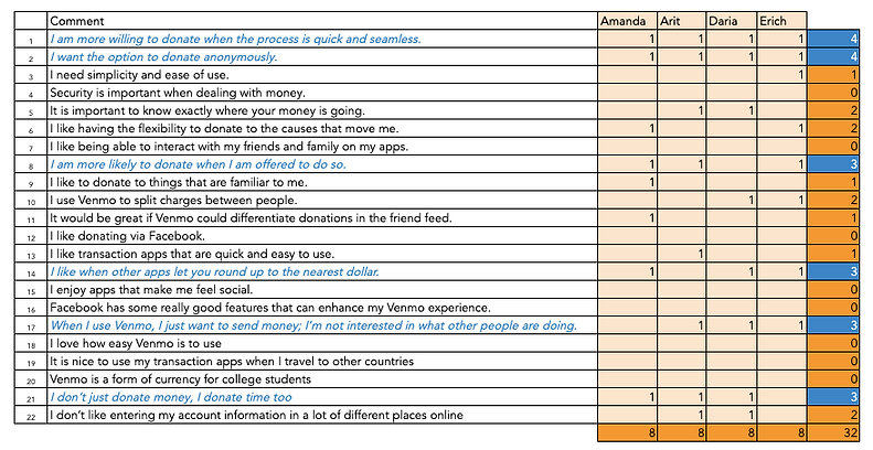
Photos of the team affinity mapping and an image of the dot voting spreadsheet.
Personas
Initially we focused our attention on the Venmo DoGooder persona but later in the process we realized that we we not capitalizing on Venmo's magic and so dove back into the research and conceptualized the Venmo SuperUser persona.
PRIMARY - VENMO SUPERUSER


SECONDARY - VENMO DO-GOODER


The hypothesis
We believe that by adding a seamless donation feature, we will enable regular Venmo users to donate more easily.
We will know this to be true when we see 10% of Venmo users donate at least once a month.
Ideation
We kicked off our ideation with a design studio, to quickly generate ideas of how to translate user insights into practical solutions.
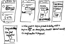
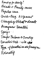


Images of rapid sketches from the design studio process.
DONATE A DOLLAR
One of the insights that came out of our interviews was that our users appreciated the ability to round up to the nearest dollar as a simple, hassle-free way to donate money which you won't miss. Our teammate Erich brilliantly took this a step further with the idea to donate a dollar.
Donating a dollar is intentional, but it is small enough to leverage Venmo's model of quick, easy transactions.
In April 2019, Vemno had 40 million active users.
10% of them donating $1 a month = $4 million for charity.
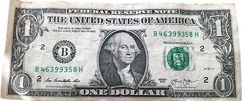
Image of the front of a one dollar bill.
App map
When mapping out the scope of the app, we realized that there are plenty of opportunities to embed the donation feature. There are so many that in our two-week design sprint it became imperative to prioritize. On the map below, the blue text signifies areas where donation could be integrated. We focused on Pay or Request, Transfer Balance, and the User Feed.

Venmo App Map with conceptual donation features integrated.
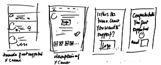
User flows
We each conceptualized a user flow. I sketched the flow for Support A Cause (later changed to Donating To A Charity) from the main user feed.
This user flow capitalizes on the social nature of the Venmo user flow. You see causes that your friends and family are supporting which encourages you to support them too.
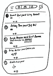

User Feed
A friend or family member has donated to a cause.
Changes to Venmo? The feed text references the donation and features the charity logo.
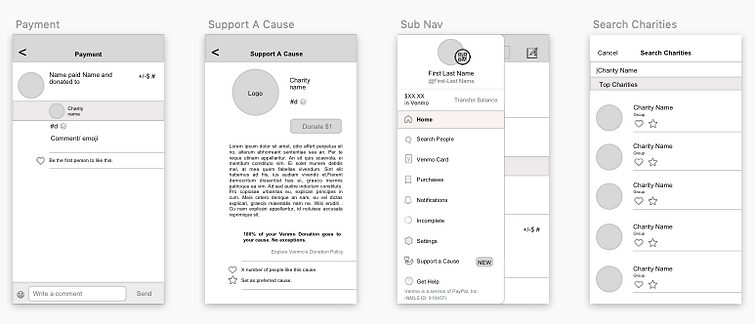
Payment Screen
Users can like and comment on payments in their feed.
Changes to Venmo? Again, the addition of the donation reference and the cause logo.
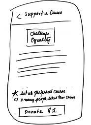
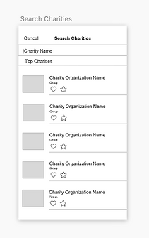
Support a Cause Screen
An entirely new screen which describes the charity, Venmo's donation policy and gives the user the ability to donate a dollar in one click.
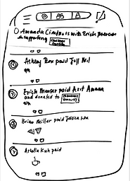
Back to the user feed
If the user decided to make this donation public, their donation joins the feed, which can inspire other friends and family members to contribute.
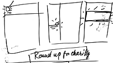
Wireframes
This project introduced us to Sketch. It was wonderful exploring the capabilities of this tool as we brought our designs to life in functional, elegant wireframes.
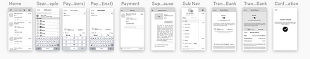
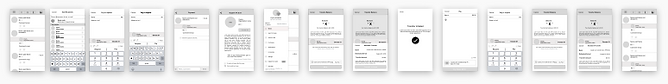
Thumbnail images of 26 low-definition wireframes from the first two iterations produced by the entire team.
FIRST WIREFRAMES
In the first batch of wireframes, we were digitally rendering our sketches as rapidly as possible so that we could get them in front of users to test.

-
Charity icons - rectangular
-
Hand drawn Transfer Balance icons
-
Placeholder text
-
Support a Cause marked as new in Transfer Balance Menu
4 low-definition black and white wireframes in first iteration.
SECOND WIREFRAMES
In the second batch of wireframes, after testing the ease of user interactions we started focusing on consistency with Venmo's UI.
-
Charity icons - circular, in line with Venmo UI
-
Donation highlighted on User Feed and Payment screens
-
Charity Organization name shortened
-
Screens renamed according to Venmo screens: Transfer Balance became Sub Nav Menu
4 low-definition black and white wireframes in second iteration.
Mockups
Using the Venmo style guide, we integrated color to our black and white wireframes respecting Venmo's UI and when necessary, making stylistic choices in line with it.
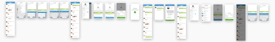
Thumbnail images of 23 high-definition mockups from the final iteration produced by the entire team.
AFTER FINAL USABILITY TESTS
We conducted six usability tests in all. Habitual Venmo users were extremely helpful in demoing the use cases they were familiar with.

-
Charity icons - circular, in line with Venmo style
-
Donation highlighted in light green on User Feed and Payment screens
-
Donate $1 button moved to foot (in line with Venmo style) and Custom Donation button added
-
Screen renamed from Support a Cause to Donate to a Charity
-
Donate to a charity option moved up on the Sub Nav
4 high-definition color mockups for final iteration.
Evolution of a single screen
The Donate to a Charity screen was created by us. With user feedback and Venmo UI adherence, it evolved significantly over the course of the project as you can see below.


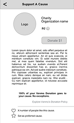
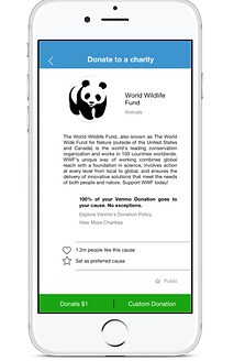
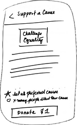
Five iterations of the Donate to a charity screen from sharpie sketch to full color mockup
Hey Venmo!
There were a couple of elements that really made this project a success:
PIGGY-BACKING OFF EXISTING USER JOURNEYS
In our initial design conception we nixed Venmo's global feed. Several of the users we interviewed were not thrilled with it. At this point we were designing for just one persona - the Venmo DoGooder. Our plan was to replace it with a donation center. But we realized that we were squandering the power of Venmo by doing this. Venmo is famous for quick, easy and fun financial transactions.
If a donation feature is separate, people won't use it. And so we integrated donation into existing flows and gave users the opportunity to donate at four critical points in their journeys:
-
when sending money;
-
when transferring balances to their banks;
-
when browsing the user feed; and
-
when perusing the main menu.
We knew we could only add a couple of additional clicks to the users’ transactions without alienating Venmo’s core user base.

UNDERSTANDING HOW DIFFERENT PERSONAS LIKE TO DONATE
How could we address the needs, motivations and frustrations of two persona groups and stay true to the Venmo experience?
Our primary persona, the Venmo SuperUser uses Venmo several times a week for mostly small transactions; and our secondary persona, the Venmo DoGooder, uses Venmo less - a few times a month - but often for larger transactions.
Our research showed us that while the Venmo SuperUser would spend time reading the news feed, it was rare for them to deposit money back into their bank account. The Venmo DoGooder however would deposit their money, but was less enthusiastic about the public nature of the news feed.
So we positioned different donation options in different user flows to address the needs of our personas. Our “Donate a Dollar” option, positioned in the news feed items and in the send money option responded the the SuperUser’s resources and habits, while the Donate More option in the Transfer balance flow and the Custom Donation option in the Donate to a Charity Flow gave the DoGooder more room to donate larger amounts.


Final high-fidelity clickable prototype
This is a video of the final clickable prototype and it is a combination of all the user flows.
What I learned
Invest time at the beginning
I was the Project Manager for this team challenge. While I’ve managed people before, I’d never recognized the immense value of defining what 'functional looks like' as a collaborative team exercise right from the get go. Investing the considerable time and energy to articulate what we were bringing to the team, our interaction styles, our ideal environment, and what success looks like kept us focused and made the process of working together seamless.